

Introduction
This note is a collection of my thoughts on how to make a dashboard that looks good and that people will use. I’ve referred to many of the concepts in this note in passing recently, and wanted to create a document to share with a wider audience, and so that I could reference it in the future.
My perspective on good dashboard design revolves around two core tenants, that 1) a dashboard should be thought of as a product, and that 2) good design is about more than colors. By applying principles derived from these core tenants, you can make dashboards that are useful, efficient, and even fun to use.
Tl;dr: To create a dashboard that other people use, want to use, and find easy to use, it is important to ground your development in that person’s unanswered questions, and apply the sound design principles that make it easy to scan, read, and interact with the dashboard.
Tenant 1: A Dashboard is a Product
Born from the “if a tree falls” thought experiment, ask yourself “if I make a dashboard that nobody uses, does it have an impact?”. To make a dashboard that gets used, it is necessary to ground dashboard development in your end user, not in your problem space or the available metrics.
Key Takeaway #1: A dashboard is not a collection of data visualizations, it is a product someone uses to answer a question
Data visualizations and how they are organized is based on your user and what they will use your dashboard to do. A good way to conceptualize this is a (modified) product pyramid
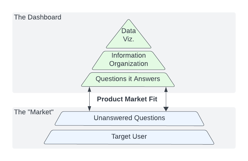
Start at the base of the pyramid with your user and determine what questions this person would have that what I am building could answer. When reasoning about how to answer those questions on your dashboard, think about how to organize your answers and order them by priority or complexity. Only after you’ve explored those questions and how to answer them should you consider what visualizations would help contribute to those answers. You find product market fit when your dashboard efficiently answers the questions your target user brings to it.
The subtext here is that our tendency is to include all information relevant to a problem space, without consideration for whether our user only cares about a subset of that information.
Key Takeaway #2: Build separate dashboard pages for different users.
You can build a dashboard that would answer any question from all of your target users, but it is likely that those answers aren’t organized efficiently or effectively. I default to 3 dashboard archetypes that answer 3 different broad questions.
- Overview Dashboards - How are our metrics trending?
- Deep Dive Dashboards - Why are our metrics trending the way they are?
- Comparison Dashboards - How do our metrics and trends compare across different cuts of the data?
There are more types of questions and further nuance to how each of the above dashboards can be constructed, particularly when dealing with real-time data, however the point is that by including too many answers on one dashboard, you make it more difficult for you users to find the one they are looking for.
Tenant 2: Good Design is not (Just) About Colors
Talking about product design is difficult, as to form well founded design critiques, you need to have the tools to communicate what we all experience intuitively.
Key Takeaway #3: Read Don Norman’s “The Design of Everyday Things”
This is a cool book that discusses usability design principles through the lens of everyday objects. The canonical example from this book is that if you’ve ever tried to open a door the wrong way, it’s not your fault, it’s the door’s fault. A well designed door tells you how to open it before you try to.
Good design in dashboarding means your user can efficiently find and understand the information they are looking for. I break this into 3 principles, which we will examine further in the next sections
- Scannability - The ability to scan a dashboard and find the information you are looking for
- Readability - The ability to understand the data and relate it to it’s business context
- Interactability - The ability to manipulate dashboard data to suit your needs
Designing for Scannability
When people use dashboards, they scan first, then read. Scanning is the process of figuring out what information is where, while reading is the user drawing business context out of individual charts. Our job as dashboard designers is to make the scanning process as quick as possible.
Key Takeaway #4: Guide the user’s eye using size, color, position, and grid patterns
While not comprehensive, this my list of best practices for enhancing scannability
- Use a fixed width - I usually start at 1280px width with 48 columns, but will go as high as 1600px. A narrow fixed width like this presents your dashboard like a text document, allowing you to scan from top to bottom. When the page gets too wide you have to scan both vertically and horizontally, which feels less natural.
- Keep widgets small - Widgets should be just large enough to be readable. When your widgets are too large, your eye has to move further to scan and connect elements, making it harder to perceive how the information is organized.
- Divide sections with colors and headers - Use color alongside vertical and horizontal dividers to section off longer dashboards.
- Order matters - Order sections by relative importance, and within sections, put the most important data at the top.
- Use Grids and other patterns - Users can scan grids in a dashboard like a spreadsheet, easily finding data by going to the respective ‘row’ and ‘column’. Repeating layout pattern across sections makes it easier for the user to predict where information will be
Designing for Readability
A readable dashboard means the user can look at each graph, understand what the data is saying, and connect that understanding to its business context.
Key Takeaway #5: Pick the right data visualization depending on your data and the user’s question
Too often, we use the wrong visualizations for the type of data we are displaying, making it difficult for the user to understand and answer their questions. Below are some common types of visualizations, and when they are best used and often misused.
- Table - Tables are useful when you are looking to look up a single value, like a particular metric for a particular part of the business. If space is a concern, tables can also be a more compact way to display information. Tables are not useful when trying to show how a variable changes over time, or if the user needs to compare values to one another, given that you have to locate, read, and compare each value in your head.
- Bar Chart - Bar charts are used to compare discrete variables (i.e. categories, large time buckets, ect.) to numerical values (counts, percents, ect.). Bar charts are great for comparing a metric across separate categories since it is easy to process and compare the height of the bars. The only real pitfall of bar charts are having too many discrete variables, causing the bars to be too skinny. In this case, you should use a table, split it in to separate bar charts, or in the case when your discrete variable is time related (days, weeks), use a line chart.
- Line Chart - Line charts are used to display a certain metric over time. Common pitfalls here are high variance metrics and having too many series. If a metric can vary widely day to day, the graph can become “spiky” and hard to read. You should consider adding data smoothing (x day averages), using and x that is large enough to make the data smooth, but not so large that you lose short term specificity. When you have too many series on a single line chart, it becomes difficult to read any individual series, or to compare single series to others. If the reason for comparison is that each individual series is a part of a whole, consider using a stacked area chart. If not, any time you have more than 3 series, consider splitting them up into separate charts.
- Stacked Area Chart - Used to compare parts of a whole over time, this visualization can be useful when trying to understand how the distribution of certain occurences in a population have changed. One pitfall of this visualization is having too many series represented, making it difficult to see and compare the differences in each. Once you get beyond 6 variables, it would likely be better to break into separate line charts.
- Pie Charts - Used to compare parts of a whole, this is a visualization you should almost never use, especially for more than 3 variables. Your brain has to strain to compare the area of different wedges, and depending on the space available for labels, you might need to connect the color of a wedge to its value in a legend. Too much thinking makes it hard to read, use a bar chart instead.
Key Takeaway #6: Ground understanding of your graphs with context
It is important to provide context on your visualizations, to ground users in the business context of the visualizations.
- Goal lines - Goal lines tell a user whether a given metric is doing good or not, relative to a predetermined goal.
- Trend lines - For metrics without static goals, trend lines help the user understand how that metric is changing over time. Sometimes a metric going in a particular direction could be a good or bad thing, or it simply can provide insight on why another metric may be moving the way it is.
- Historical context - Including a historical context line on your graph lets your user understand how the data compares to previous periods.
- Traffic lights - Traffic lights, or a green / yellow / red coloring system, are a powerful tool for communicating whether a given metric is good or bad, relative to a set of guardrails. You can add these as cell colors for metrics in a table, as horizontal lines to line and bar plots, or literally include a traffic light as a data visualization.
Designing for Interactability
Designing for interactability is tricky. You want to give the user the ability to manipulate the data to their needs, but incorporating too many or too few selectors for a given audience can make the dashboard less effective for that audience.
Key Takeaway #7: The more “executive” the audience, the less selectors you should have.
For any given audience, you should ask what is the bare minimum number of selectors they need to answer the questions they would bring to this dashboard. Given a data set, there are likely a large number of ways you can cut and manipulate the data like it’s time granularity, time period, comparison mode, population, ect. Some audiences only need a couple selectors for their use case, with the inclusion of others negatively impacting usability by introducing unnecessary complexity.
Furthermore, where you place your selectors is important, as their position conveys their functionality
Key Takeaway #8: Only include selectors at the top of a dashboard
In Don Norman’s “The Design of Everyday Things”, the principle of “mapping” is the relationship between the controls and the effect they have. The example he gives is knowing which knob turns on which burner on a stove. On a poorly designed stove, you need to turn burners on and off until you find the right knob.
When you place selectors at the top of your dashboard, the user understands that any data below those selectors will be affected when you change those selectors. Once you start putting selectors intermingled with your data, it becomes unclear which selectors affect which widgets.

